-
class全部分类keyboard_arrow_down
favinavi网络收藏夹Ver 2.0开发笔记之更精细适配各类屏幕
为什么会做favinavi网络收藏夹网站?记录一下心路历程 HTML5时代,使用同一个背景图片的多个链接自动适配不同屏幕宽度的一种方法 网站开发测试环境启用https,使用自签发ssl证书不是个好主意 更全面匹配UTF-8中文汉字的正则表达式 把favinavi网络收藏夹的书签搜索功能做到最好 家用服务器proxmox 7.3开启samba共享目录 网络收藏夹的正确打开方式是怎样的? 对比一下几个中文网络收藏夹的实用性之手机适配篇 CSS学习心得:多行文本两端对齐,同时溢出部分自动截断并添加省略号... 更多... -
folderCSSkeyboard_arrow_down
CSS背景图片分割之大图小用 无法明确指定大图的宽度width和height时,如何避免累计布局位移CLS? 使用CSS让大背景图片适应不同大小屏幕又一例 一个使用CSS/HTML将图像自适应屏幕的示例 网页图片CSS进阶篇——优化图片,提升网页加载速度 CSS学习笔记:flex布局做出元素两端对齐效果 CSS学习心得:多行文本两端对齐,同时溢出部分自动截断并添加省略号... MDUI前端框架,表格头position: sticky无效的问题 几种CSS字体描边和阴影效果 CSS3特效“喜欢/Like”动态按钮,一颗会跳动的心脏 更多...
-
folderHTMLkeyboard_arrow_down
了解onenav 无法明确指定大图的宽度width和height时,如何避免累计布局位移CLS? 关于网页上的复选框checkbox的checked和value的问题 使用CSS让大背景图片适应不同大小屏幕又一例 一个使用CSS/HTML将图像自适应屏幕的示例 CSS3+SVG实现的带音效、会抖动的小铃铛图标特效 CSS3 一款漂亮的带渐变背景和关闭按钮的卡片头样式 HTML5时代,使用同一个背景图片的多个链接自动适配不同屏幕宽度的一种方法 css实现图标或图片等元素镜像翻转(水平镜像、垂直镜像) CSS实现倾斜绶带式45°标签 更多...
-
folderjavascriptkeyboard_arrow_down
javascript捕获缺省的组合快捷键,比如CTRL+F 关于网页上的复选框checkbox的checked和value的问题 自用小工具:正则表达式测试是否能匹配字符串 CSS3+SVG实现的带音效、会抖动的小铃铛图标特效 php/javascript的一些关于时间处理的函数 更全面匹配UTF-8中文汉字的正则表达式 https协议下javascript复制内容到剪贴板
-
folderPHP/Otherkeyboard_arrow_down
我的酱香之路(一) A PHP method for determining whether a browser supports AVIF images php判断浏览器是否支持avif格式图片的一种方法 统计搜索引擎对网站地图文件或robots.txt的访问记录的一种方法 网站的页面访问量以及搜索引擎爬虫访问量的统计方法 网络收藏夹网站开发过程中PHP正则表达式忘记使用非贪婪模式带来的一次教训 Apache2网站安装开通https协议SSL证书 php/javascript的一些关于时间处理的函数 更全面匹配UTF-8中文汉字的正则表达式 Ubuntu 22.04 live server更换亚马逊AWS的更新源 更多...
-
folderITkeyboard_arrow_down
家用服务器proxmox 7.3开启samba共享目录 你的网站会有不请自来的访客吗? 网站开发测试环境启用https,使用自签发ssl证书不是个好主意 搭建家庭用服务器全套攻略,300元一台小主机全部搞定 mysql8开启主从同步注意事项,否则会动不动就出错停止 使用基于Cookie-Free域名加载CSS时,解决字体文件无法加载的问题 Applebot是什么? win11安装跳过TPM2.0和安全启动检查的方法 网络收藏夹的正确打开方式是怎样的? favinavi网络收藏夹Ver 2.0开发笔记之更精细适配各类屏幕 更多...
在线笔记
favinavi - 人性化网络收藏夹
CSS3 一款漂亮的带渐变背景和关闭按钮的卡片头样式
by: fanshome
2023-05-20 13:50(UTC)
演 示
使用css: linear-gradient来实现线性颜色渐变背景,效果见下图:
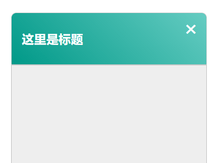
点击“演示”按钮可以查看效果。
CSScontent_copy复制代码
.box{
	width:300px;
	height:360px;
	margin:60px auto;
}
.boxHeader{
	background: linear-gradient(44.24deg,#098 0%,rgba(0,170,153,.6) 100%);
    width: 100%;
	height: 80px;
	padding: 8px 16px;
	box-sizing: border-box;
	border: 1px solid #ccc;
	color: #fff;
    border-top-right-radius: 8px;
    border-top-left-radius: 8px;
	position:relative;
}
.cancel{
	width:32px;height:32px;
	font-size:20px;
	line-height:32px;
	cursor:pointer;
	text-align:center;
	color:#fff;
	position:absolute;
	top:8px;right:8px;
}
.cancel:hover{
	color:#eee;
	background:#0ba;
	border-radius:50%;
}
.content{
	width: 100%;
	height: 100%;
	background:#eee;
	box-sizing: border-box;
	border: 1px solid #bbb;
}htmlcontent_copy复制代码
<div class='box'>
<div class='boxHeader'>
<div class='cancel' onclick='closeBox()'>✖</div>
<h3>这里的背景是渐变色</h3>
</div>
<div class='content'>
</div>
</div>javascriptcontent_copy复制代码
$=mdui.$;
function closeBox() {
	$('.box').hide();
	setTimeout(() => {
		$('.box').show();
	}, 600);

}
visibility 896
favinavi - 重度网络用户必备
在线笔记
-
subject CSS学习笔记:flex布局做出元素两端对齐效果
很久以前,还没有flex布局方法的时候,想要在同一行内的两个元素分两端左右对齐,应该使用float方法,左边的元素使用float:left; 右边的元素使用fl...
-
subject CSS学习心得:多行文本两端对齐,同时溢出部分自动截断并添加省略号...
在卡片列表式页面展示文章内容时,除文章标题外,经常需要显示文章简介。简单粗暴的做法就是只显示文章的开始部分内容,这时就会要求简介部分固定高度,不能超出,同时尤其...
-
subject 网页图片CSS进阶篇——优化图片,提升网页加载速度
说到提升网页中图片加载速度,一般立即想到的是给图片瘦身,比如减小图片尺寸,或者通过工具降低图片文件大小,比如png图片,可以利用在线压缩PNG图片网页工具,一般...
-
subject 关于网页上的复选框checkbox的checked和value的问题
这个问题相信很多像我一样的非专业开发者遇到过,就是感觉checkbox是一个神奇的存在,为什么这么说?就是在开发网页过程中,有时候使用checkbox一切顺利,...
-
subject php判断浏览器是否支持avif格式图片的一种方法
最新一代图片压缩格式avif非常好,图片缩小体积效果十分明显,各大公司的新版浏览器已经纷纷支持。 可是,可是!微软的edge到目前为止(2023-06)还没有...
-
subject 纯CSS3做一个带箭头指向的漂亮的带阴影提示框
纯CSS3,不使用图片。先看下最终实现的效果图: [img] 这里以指向右侧的尖形小箭头为例,其它方向请自行修改。

 发表评论
发表评论