-
classAn example of increasing productivity with the Favinavi web favorites sharing feature CSS3特效“喜欢/Like”动态按钮,一颗会跳动的心脏 A PHP method for determining whether a browser supports AVIF images 如何获得高质量网站的外部链接 CSS3 一款漂亮的带渐变背景和关闭按钮的卡片头样式 最好用的网络收藏夹应该是什么样? CSS学习心得:多行文本两端对齐,同时溢出部分自动截断并添加省略号... 无法明确指定大图的宽度width和height时,如何避免累计布局位移CLS? Applebot是什么? 更多...全部分类keyboard_arrow_down
-
folderCSSkeyboard_arrow_down
CSS背景图片分割之大图小用 无法明确指定大图的宽度width和height时,如何避免累计布局位移CLS? 使用CSS让大背景图片适应不同大小屏幕又一例 一个使用CSS/HTML将图像自适应屏幕的示例 网页图片CSS进阶篇——优化图片,提升网页加载速度 CSS学习笔记:flex布局做出元素两端对齐效果 CSS学习心得:多行文本两端对齐,同时溢出部分自动截断并添加省略号... MDUI前端框架,表格头position: sticky无效的问题 几种CSS字体描边和阴影效果 CSS3特效“喜欢/Like”动态按钮,一颗会跳动的心脏 更多...
-
folderHTMLkeyboard_arrow_down
了解onenav 无法明确指定大图的宽度width和height时,如何避免累计布局位移CLS? 关于网页上的复选框checkbox的checked和value的问题 使用CSS让大背景图片适应不同大小屏幕又一例 一个使用CSS/HTML将图像自适应屏幕的示例 CSS3+SVG实现的带音效、会抖动的小铃铛图标特效 CSS3 一款漂亮的带渐变背景和关闭按钮的卡片头样式 HTML5时代,使用同一个背景图片的多个链接自动适配不同屏幕宽度的一种方法 css实现图标或图片等元素镜像翻转(水平镜像、垂直镜像) CSS实现倾斜绶带式45°标签 更多...
-
folderjavascriptkeyboard_arrow_down
javascript捕获缺省的组合快捷键,比如CTRL+F 关于网页上的复选框checkbox的checked和value的问题 自用小工具:正则表达式测试是否能匹配字符串 CSS3+SVG实现的带音效、会抖动的小铃铛图标特效 php/javascript的一些关于时间处理的函数 更全面匹配UTF-8中文汉字的正则表达式 https协议下javascript复制内容到剪贴板
-
folderPHP/Otherkeyboard_arrow_down
我的酱香之路 A PHP method for determining whether a browser supports AVIF images php判断浏览器是否支持avif格式图片的一种方法 统计搜索引擎对网站地图文件或robots.txt的访问记录的一种方法 网站的页面访问量以及搜索引擎爬虫访问量的统计方法 网络收藏夹网站开发过程中PHP正则表达式忘记使用非贪婪模式带来的一次教训 Apache2网站安装开通https协议SSL证书 php/javascript的一些关于时间处理的函数 更全面匹配UTF-8中文汉字的正则表达式 Ubuntu 22.04 live server更换亚马逊AWS的更新源 更多...
-
folderITkeyboard_arrow_down
家用服务器proxmox 7.3开启samba共享目录 你的网站会有不请自来的访客吗? 网站开发测试环境启用https,使用自签发ssl证书不是个好主意 搭建家庭用服务器全套攻略,300元一台小主机全部搞定 mysql8开启主从同步注意事项,否则会动不动就出错停止 使用基于Cookie-Free域名加载CSS时,解决字体文件无法加载的问题 Applebot是什么? win11安装跳过TPM2.0和安全启动检查的方法 网络收藏夹的正确打开方式是怎样的? favinavi网络收藏夹Ver 2.0开发笔记之更精细适配各类屏幕 更多...
What should the best web favorites look like?
What should the best web favorites look like? Let's clarify the premise of the discussion here, see: What is a web favorites/online bookmarking.
I am afraid that everyone's answer to this question is different. But in the understanding of favinavi, in addition to the basic functions of general network favorites (such as adding, editing, deleting, importing, exporting), it is to see the convenience of use.
What is convenience? The ultimate convenience is called convenience. What are web favorites used for? Of course, it is used to surf the Internet, translated into the vernacular, that is, you can use the fastest speed to access your favorite website.
How fast can it be fastest? Favinavi's understanding is just one click! One click in the true sense of the word.
Some people will say, this is nonsense! Which bookmark link is not a one-click jumper?
That's right, but I mean: after opening the browser (this time the click is not counted, because everyone uses a browser or browser-like software, so it is not counted), just one click. Specifically, if a certain prerequisite is met, the browser is opened, and the favorite website can be immediately accessed with another click.
It sounds like nothing, let me give you another example: the browser's own bookmarks bar, in the case of chrome, even if you have the Show bookmarks bar turned on in your settings, in general, you need at least 2 clicks to access specific bookmarks. Even if some browsers can directly display bookmarks below the address bar, have you ever thought about it, assuming that there are more bookmarks in favorites? For example, 50, it is impossible to display in one line, if multiple lines are displayed, and it takes up too much of the browser's own screen space, the space used by the browser to display the real web page content is crowded.
One or two clicks worse seems to be nothing, but for heavy Internet users, it seems that most people are still lazy, always hoping to do everything as convenient as possible, the faster the better.
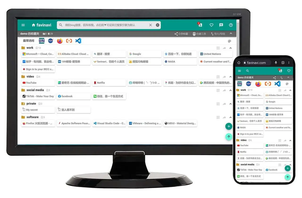
This need for extreme laziness in human nature is the focus of Favinavi's attention. If the user sets the https://favinavi.com as the browser launch page, then you can truly achieve "one-click to fly", because the home page of favinavi is the user's favorites, open the browser, favinavi will try to display the user's favorites directly as much as possible, and the number of bookmarks displayed is pursued as much as possible, the more the better, and at the same time automatically count and display the most frequently visited bookmarks by users. In this way, basically, frequently visited websites are "one hit away", and even scrolling pages are basically not used.
The difference is not very important for light browser users. However, favinavi is mainly intended for those heavy Internet users, for those Internet users who have at least dozens of bookmarks in their favorites, and for lazy cancer patients who want to be lazy in everything.

Intuitive display, the more the merrier, one-click direct, is the characteristic of Favinavi.
Are you impressed? Register Favinavi right now to feel it
visibility 3740
-
subject win11安装跳过TPM2.0和安全启动检查的方法
为了在一些相对老旧的机器上安装windows 11,我们需要跳过win11安装程序中的TPM2.0检查,方法如下: 进入安装界面后,按Shift+F10打开命...
-
subject How long a new website can occupy the first position of search engine
Whether a new website can rank first on the main keywords depends on many factor...
-
subject 最好用的网络收藏夹应该是什么样?
最好用的网络收藏夹应该是什么样?我们这里先明确一下讨论的前提,参考:什么是网络收藏夹/网络书签。 这个问题恐怕每个人的答案都不尽相同。但是以favinavi的...
-
subject Ubuntu 22.04 live server更换亚马逊AWS的更新源
amzon亚马逊云AWS的更新源,即使在国内速度也基本可接受,其最大特点是软件丰富,常用软件包几乎没有找不到的。 具体步骤如下:
-
subject 一个纯CSS的最小干扰的渐变色彩虹loading bar
Loading图标,又称“加载中”图标,以往是用gif格式动图来实现。但是gif有一个比较明显的问题,不易调整大小,然后图片一般比较粗糙,颗粒感严重。 现在流...
-
subject 我的酱香之路
一、 男人喜欢喝点酒,是一件很正常的事。我其实并不太懂酒,也不算是酒鬼,平时在自己家里基本不喝酒。现在,假如可以选择,那么我只喝酱香酒。 咱们中国人,一般来说...
